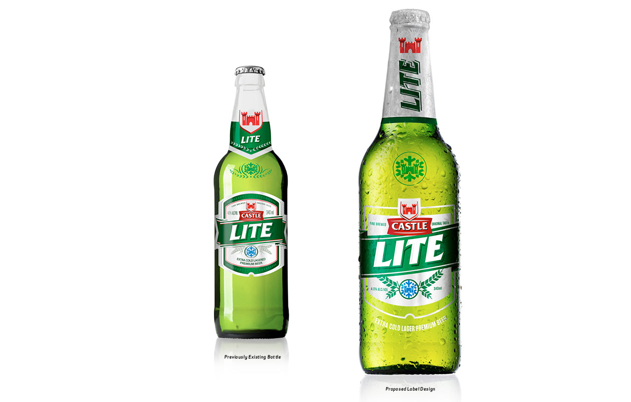
In December 2012 the South African beer Castle Lite bottle design went out to pitch. We didn’t win the pitch but this was my evolutionary craft process. For me it was important to respect the bottle and the existing label, in order to avoid alienating its already huge following, but at the same time “refresh” and update.
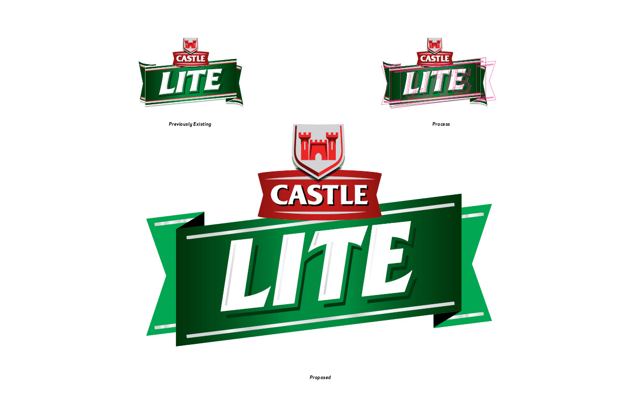
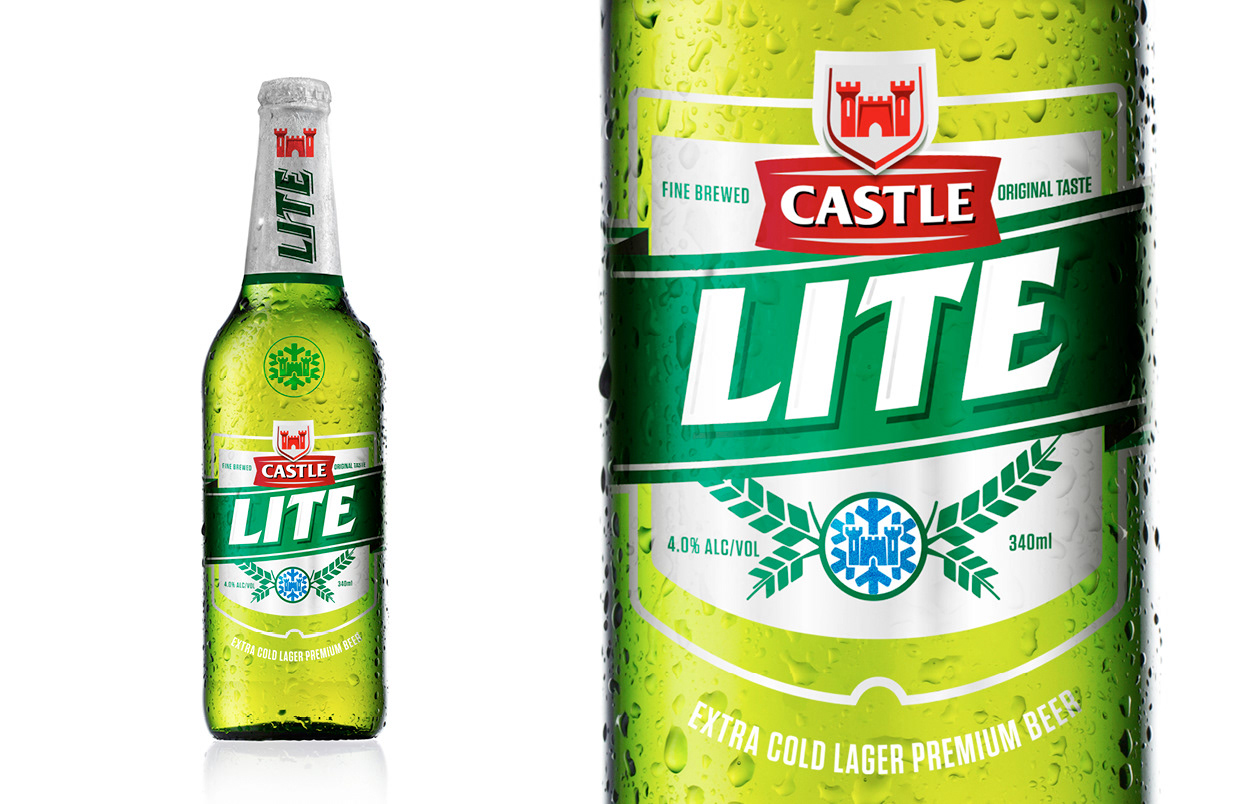
My thinking behind the evolution was to base it on Castle Lite’s core idea “Cold” This influenced my crafting of the type, taking out the rounded curves. Thinning the type out for a “lite” feel and giving the it a more angular aesthetic, inspired by the angles in a snow flake. This train of thought was applied to the ribbon device and “cold” crest device. All of which was designed with the entire bottle and label in mind.
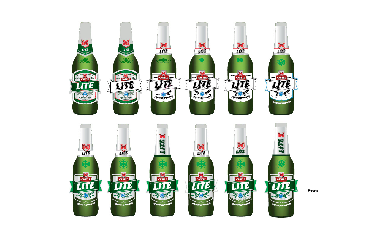
Theses are some of the hundreds of micro craft steps I took to get to my final label. My final proposal made use of PSL clear printing substrate, to help the label seem lighter and enable me to use the bottle as a colour within the label design. Foils were used to give it a premium feel.